Showing posts with label octopus. Show all posts

2/27/11

I've Been Busy


I’ve been pretty busy. With things other than art that is. I have been meaning to update this blog. Before we get to business though, an announcement.
I’ve received confirmation from the art department at Woot! that my shirt featuring a gigantic orange octopus attacking the Empire State Building titled “It Would Be Epic If…” has been accepted and will print as a daily tee sometime in the next 6 weeks! This is huge for me as it’s my first major printing. To date this is my favorite tee design. I think it’s very wearable and really done in my true style. I love monsters and things attacking cities so this one was right up my alley. Though the down payment for the design is a large one, let’s hope is sells well as the royalties I could stand to make on a hit selling shirt are huge! I have already decided that if an extra 500 shirts are sold after day one, I am taking the royalty money I will receive and buying a Wacom Cintique tablet. I have signed an exclusive contract with Woot! and am just waiting for a confirmation on the date and my tax forms etc. I will update my readers with more information as to the sale when I have it.

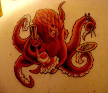
This is my latest project that I’ve been working on. If you’re a reader of my blog, you’ve already seen the pencil drawings. This is the ink work. There are some things I still need to fix, but I’m not exactly disappointed with the way things are going so far. I will say that I think something’s missing. Throughout the process of inking this piece, I stopped and restarted from the beginning 2 or 3 times. I wasn’t happy with the quality of the lines being created and it felt rushed to me. To remedy the situation, I brushed up on my Illustrator skills and created a whole new range of ink brushes. I’m still not entirely happy with drawing completely on a computer via the tablet though. I use a Wacom Bamboo Fun that my girlfriend, Natalie, bought me for Valentine’s Day last year. Before that, I used a 12” Wacom Intuos II. I still had trouble then. I really think the quality of my artwork will increase exponentially if I upgrade to a Wacom Cintique. To be able to draw on an LCD screen and see what I’m creating in real time would be amazing. 

 This is a progress shot of the color work I'm doing so far. Once again, I'm just not happy with the way things are going. I am not convinced the colors are correct. I have this vision of a wild drab blue sea sort of reincorporating it's self with the navy blue of the tee shirt. I picture stormy skies of half tone dots, a glowing lamp on the crows nest, maybe even a bolt of lightning crashing. I guess I will keep doing what I'm doing as I can always, and usually do, change the colors individually after all is said and done. I need to keep this design restricted to 6 colors to be marketable. I'm hoping everyone gets the inside joke and has a little chuckle when checking out this shirt.

Well, that's my update. I've got 4 or 5 other designs in the idea phase. I have one giving a satirical nod in the direction of the great I Can Has Cheeseburger website. I've got a few others but as for right now, the I Can Has Cheeseburger design is standing out as the next one I'll be working on. I'm just starting to get concerned that I will be typecast as the giant animals attacking things guy. That should be a hint as to the I Can Has Cheeseburger idea. As always, thanks for reading, and please, by all means leave me a comment and let me know what you think about the progress of my Deadliest Catch design. I feel like I need all the critiques and help I can get on this one.

1/22/11

It Would Be Epic If...

Well, the hard work is over! My octopus tee-design is done!!! I have submitted this guy to the staff over at Woot! with hope that it will run as one of their daily tee's. I thank those of you who have been with this one since day 1 following me from sketch to finished product. And if you haven't, then please read back in my previous several blog posts to see get a glimpse at my design process. Maybe you'll get a clue as to what makes me tick since I sure as hell don't know what does.

This shirt has been a special project of mine. This was an idea for an illustration I had a few years ago. I did like a 6x9 ink and water color sketch and filed it away forever. I never knew I would be resurrecting it in this forum. I'm so much happier with this final design.

This design is also different for me in the sense that I'm not submitting it as a derby entry. Instead I'm sending it to the staff at Woot! directly in hopes that they'll love it and run with it. The pay would be greatly appreciated as well as any royalties if this design would sell. I know I would rock a shirt depicting a giant octopus terrorizing the Empire State Building... wouldn't you?

I'd like to thank Natalie for bearing with me as this design ate away of my time and attention, and for convincing me to change the color scheme last minute. She is my best critic when I get tunnel vision.

Here's the tee comp I submitted to Woot! This is really my "pitch" for them. Let me know what you think! As always, comments and shout-out's are welcome.

1/19/11

An Update on the Octopus!

I put a lot of work into the Octopus Disasterpiece design tonight. I finished the inking layer and even began to color! I've laid down my flat colors and am calling it quits for tonight.

I need to do all my fancy half-tone screens, background, transition back into the shirt and lay it out on a shirt before I submit it to the all-knowing art directors over at Woot!
to see if they would like to run it as a daily tee.

Here's where I'm at:


Right now we're at 4 colors, black, whitish color, pink and cream; all on a light blue tee. I may add 1 more color, a darker pink to screen into the shadows of the octopus for more depth.

As always, I want to hear what you think! Drop me a shout out! Let me know if you have an ideas for this piece also!

1/16/11

The Latest Project

If you know me personally, you know I love Octopi. I think they're very cool looking, very alien, and extremely intelligent creatures. On my back left shoulder I have an octopus drinking beer and eating sushi tattooed. It's my avatar image.

Any way, this design has been an idea of mine for years. I did a water color and ink sketch of it 3 or 4 years ago and sort of left it at that. Well, from out of retirement comes this:

My idea was to have the giant octopus attacking the Empire State Building much like King Kong. He will be encircled with attack helicopters and wreaking havoc on New York City.

I re-drew this pencil sketch yesterday morning. I took my time and used many references to get the anatomy right. There are a few anatomical issues that are getting corrected as I progress.

And speaking of progressing, I have some progress on the inking:

I've been inking this guy most of the weekend. I'm known for my love of crosshatching in inking. I'm looking for a certain edgy level of detail in the finished piece. I want the building to be un-deniably the Empire State Building. i also want to do a feathered skyline in the back.

I see this on a light blue tee. The building will be a cream color, the octopus will be a pinkish color. The image would dominate pretty much the whole front of the shirt. I think it's gonna be really cool when it's done and I would love to wear one. I'm sure others would too. What I'm really trying to say is I think I have a marketable design, and in my current financial situation, marketability is important.

As usual, click any one of the designs for a larger image with more detail. Drop a comment and let me know what you think, if you have an suggestions or if you would wear this shirt upon completion.

As always, thanks for reading and coming back. I hope I can post a finished piece this week! Till next time...

11/23/10

And They're Off! - Crossthatch Derby Entry

The Derby: - Derby #174: Crosshatch
Back in the g-, well, not really GOOD old days...back in the old days artists didn't have your fancy Photoshops and Illustrators and four-color printing methods. They didn't have much at all, really, which is why they invented hatching, also known as cross-hatching (we're calling this Derby cross-hatching so 50 people didn't immediately start sketching cracked eggs before reading this far). Using lines of varying length, angle, thickness, closeness, etc. artists could create the appearance of depth, volume, brightness, and color. Now we want you to do it. Using only hatched lines (no, cribbing from our line art Derby won't help), create t-shirt magic. For inspiration and more info, look up masters like Martin Schongauer and Albrecht Dürer or our favorite, Edward Gorey. Now for the rules:

Designs must be one color only. Whatever shade that first line is, so shall all your lines be.

Line width must be a minimum 2 point. Otherwise we might have to reject it due to "un-printability."

No video games.

No Star Wars.

No text.

No depictions of things hatching. A totally random rule from a totally random Woot staffer totally-randomly named Randy.

And once again, a reminder about our new de facto print requirements. These are the new rules for submitting art from here on out, so we'll be posting them every now and again so everyone gets a chance to see them (even if they might not be relevant this time around):
If you're using Photoshop, make certain that your halftones are at least 30 LPI for a full-size design at 300 DPI.

If you're using Illustrator, please submit your final art with gradients. We'll create the halftones on our end.


I love this derby. Cross-hatching has always been my thing. I love to work in ink and cross-hatching is the name of the game. I especially love that this is a 1 color entry.

The image I had in my head was an octopus for some reason. I wanted to do something scratch-board like illustrating the light values only. Here's what I came up with:


Currently I'm in 49th place with 65 votes. It's kind of dis-heartening because I really fell in love with this piece. But, I'm glad to be as high on the list as I am. I guess at this point in the game no publicity is bad publicity.

I designed this entirely in Adobe Illustrator CS5 in about 3 hours. I had a blast working on it. Very little agony went into this piece unlike others I have done. Though I think it's too late to pull ahead and get in the top 3, I am proud to call this one my own.
Blog content and images posted copyright Alexander Pawlicki. Powered by Blogger.