 |
| Final Design Comp |
Well folks, this will be another blog entry where I walk you through how I designed this shirt. I just completed this about an hour ago and am totally in love with it. I've submitted it to Woot! as a daily entry and have my fingers crossed on a printing.
There is no pop reference in this shirt, and really the concept kept changing. This design really came out of nowhere and is a perfect example of something that was created just because it was in me. Read on for the walk through. You may find the story behind this design entertaining!
This design really started with me just puttering around because I was bored. I think some of my best art starts that way. I wanted to toy with a new brush I created in Photoshop that you will see in the black line work. I also wanted to doodle using simplified shapes.
 |
| Blue Sketch Work |
With shapes in mind, the blue line work to the right is how I started this piece. It all began with the gum drop shape of the dog. I didn't know it was gonna be a dog, it just sort of evolved that way when I started slapping arms, legs, a tail and ears on it. I love ridiculous expressions in cartoons so this one was a natural. My original sketch was that of a UFO and a giant dog chasing it out of a city.
 |
| Pencil Work |
Next, on my pencil line work on the right, you will see where my new brush experimentation comes in. I created a Photoshop brush that has a lot of variance in it. I wanted it to feel like it was drawn on a rough piece of paper. Not polished and shiny, more organic. I tried to keep these pencils very close to my blue lines. At this point, I didn't even expect to complete this for a shirt. I am still just playing around.
 |
| Black Ink Work |
In these ink lines, I cleaned up what I did on my pencils. You can see I've dropped the city. At one point I toyed with the idea of having a nuclear power plant in the background. Maybe this is a radioactive doggy? In any case, nothing is solid yet, just cleaned up. I really am in love with this piece at this point and send it off to some illustrator friends of mine for advice. I get a lot of advice and pick and choose from it. This dog doesn't make sense on earth. This is no earthly dog.
 |
| Final Design, No Half-Tones |
This is my final piece. The background was drawn and re-drawn again several times until I was happy. I love the moody sky with barely a hint of an atmosphere. I wanted things added to the foreground to show scale of the dog. I wanted to emphasize his playful clumsiness by having him crashing into the mountains on his right. I took a lot of coloring advice from DC Comic Book Colorist Tony Avina, a personal friend of mine. Another illustrator friend of mine, Cole Lemke explained that perhaps the horizon line should be a lot lower. I really think this helps with the perspective and scale of everything in the image.
In the end, I'm thrilled. It took a total of maybe 5 hours to do this piece and I really go to play with shapes, line, mood light and shadow. Most important to me, I was able to do this entire piece using only 4 colors! It's been submitted to Woot! and I will sit for the next 2 weeks on pins and needles waiting for a response! Thanks for reading! I really hope it prints so I can do a tee shirt giveaway with my freebies. Should Woot! not want it though, I'm sure we may be seeing this in my online print and tee stores.
| 


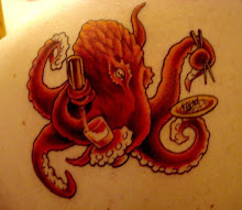

 If you know me personally, you know I love Octopi. I think they're very cool looking, very alien, and extremely intelligent creatures. O...
 Welcome, welcome to my poor ignored little blog space. They say that the key to having a successful blog is keeping active with it. Updating...
 I’ve been pretty busy. With things other than art that is. I have been meaning to update this blog. Before we get to business though, an ...
 Shirt.Woot! shocked and excited their artists this week by announcing this weeks derby theme to be zombies! Zombies have become a pop cultur...

1 shout outs:
I like this post .
Wholesale Custom T-shirt Printing Store in California
Wholesale T-shirts Screen Printing Shop in California
Best Cheapest T-shirt Screen Printing Shop in California
Post a Comment