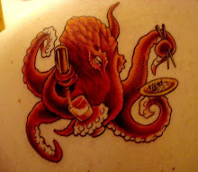
 |
| Final Tee Shirt Design. Click to Enlarge. |
This is only a 3 color tee shirt design. I've had people ask me how I get the level of depth I can get in so few colors. I learned from Youtube videos from a good friend of mine, artist Tony Avina. Any way, this blog entry is all about this piece from start to finish. We will explore my thought process, why I decided to do certain things and what steps I took to achieve this final product. I'd love to answer and questions or if you have any tips on how I can do a certain process even easier, then by all means let me know! Thanks, and enjoy the walk-through.
Step 1: Concept Sketch
 |
| Concept Sketch. Click to Enlarge. |
So, after perusing the Affliction website and deciding I was in trouble, I got a few ideas, but decided I wanted to put my own spin on this design. The picture to the left is the concept sketch I sent to my client. You can see sometimes I talk to myself on paper and ask questions and take notes. Though overall, a lot of the basic idea of this design stayed the same in the final product, there were a lot of changes on the way.
Step 2: Pencils
 |
| Finished Pencils. Click to Enlarge. |
Now, when I pencil, I have a few habits. First, I like to "x" large areas that will get filled in. I also like to scribble these areas in. This is basically leaving me a note saying, "Hey, when you ink me, just fill this part in." Also, if you look at the speakers and the mics, you will see I just roughly slashed some lines representing the mesh pattern. This is not how I intended to ink the final at all. What I'm really doing is leaving a symbol representing a mesh. To achieve the true mesh feel later on when I ink, I will have to look at several photo references so I know how to draw it. It's also in that phase that I abandon the boom-box from this drawing for more of a ghetto-blaster look.
Step 3: Inks
 |
| Partially Finished Inks. Click to Enlarge |
Inking is by far the longest step in my opinion. There is a lot of fine tuning and detail that goes into inking. When you ink, you are creating form and the general feel of the overall piece. I wanted this one to have a darker feel so that's where I went with it.
When you look at this piece to the right, the first thing you're going to notice is that there are a lot of things missing. That's because this one is from a progress report I sent to my client and isn't the finished inks. You will also notice that my line weights changes in the final piece. That's because I saw the initial problems and weak areas in this step of the process and went in for cleanup and adjusting after I finished laying everything down.
I only ever ink digitally. When inking, the ability to hit "undo", to copy and paste and to re-size and adjust things is invaluable. You will make mistakes. In fact, you will make a lot of mistakes. It's frustrating for me and takes a long time. This is the phase of the process that I procrastinate the most. I'm not an inker so I hate doing it. But it's a very important step that absolutely has to be done.
Step 4: Flat Colors
 |
| Flat Colors. Click to Enlarge |
You may notice I also added a texture to the crest. I did this by taking one of the many high resolution texture files I keep, in this case concrete, and creating a half-tone of it. I do that by first overlaying it on top of the gray layer. I erase until it's just over the crest and then I select everything on that texture layer and copy it. I go to "new" and start a new document. I make sure that my resolution is the same (300dpi) and I will be working in grayscale. I paste the shield texture and go to Image>Mode>Bitmap. I make sure I am making round dots for this screen and that my settings are where I want them. I experimented a lot to find the settings I'm comfortable with. Then I copy it out of there and paste it back in place on the coloring file. All I gotta do is delete all the white on that layer and delete the un-halftoned original texture layer. Now that texture is entirely composed of solid black half-tone dots.
Now, you will see I'm only working in 4 colors at this point. Red, black, white and grey. I know what you're thinking, "But Alex, you told me you did a 3 color design at the beginning of this whole walk-through." That's true I did. In the end, one of the color layers will actually be represented by the tee-shirts color it's self. I think it's important not to put too much ink on a shirt as it can be itchy and uncomfortable. Plus, the fewer colors you print, the cheaper the shirt is!
Step 5: Rendering
|
| Final Rendered Piece. Click to Enlarge |
In the end, after everything is rendered and half-toned, to make sure no half-tones overlap each other, I need to start deleting content. What I do is start with the top most layer, in this case, the ink layer. I select all the black in that layer, and going down each individual layer, I delete that selected section of color. This will ensure that the only thing that will print in that section will be the black. I do this for each individual layer until I'm at the bottom. Once I'm there, I select all layers that contain like colors and I merge them together. The layer order stops mattering since nothing is overlapping anything. Now I'm back down to 4 layers. Black, red, white and gray. I created the final tee comps by selecting all the color layers except for the one assigned by the shirt color and pasting this image onto that shirt laid out how I want to present them.
 |
| Final Design Comp - Click to Enlarge |
So that's it! This was probably my longest post ever but it was fun to re-live this piece step by step and answer some questions I've received in the past few months about my process. Not everyone works like I do. In art, there are an infinite number of ways to do things. This is just the way I'm comfortable doing things. Not a piece goes by though where I don't learn a newer easier way of doing something. So, I'm sure I'll have another walk-through in the near future. Thanks for reading and as always, I love comments and feedback! Let me know your thoughts and questions! Thank you.


2 shout outs:
love tutorials like this ! inspiringly ! :)
Thanks!
Post a Comment